Top 5 Data Visualization Tools: Your Complete Guide

Data drives decisions, but only when you can see it. Raw numbers sit in spreadsheets gathering dust while insights hide in rows and columns. That's where data visualization tools come in. These software solutions transform messy datasets into charts, graphs, and dashboards that tell a story anyone can understand. Whether you work in tech, finance, marketing, or healthcare, using the right data visualization tools can mean the difference between missing opportunities and spotting them first.
In this guide, we break down the five best options available today and show you which tools for data visualization fit your needs.
What Is Data Visualization?
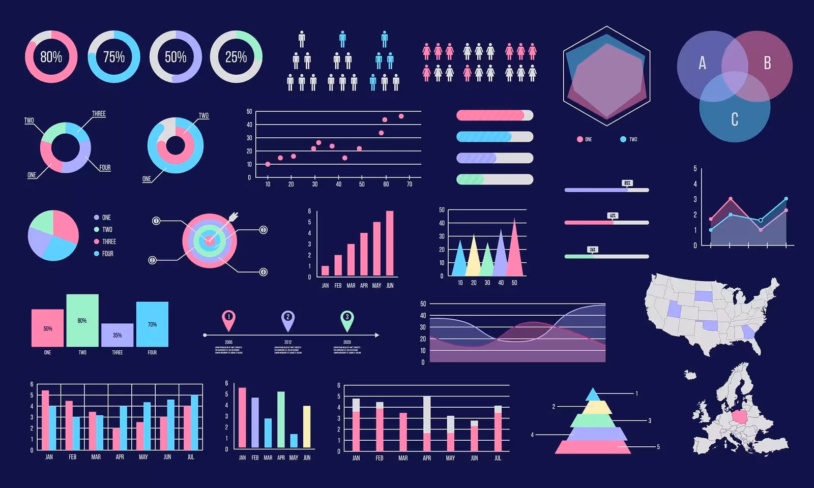
Data visualization turns numbers into pictures. Instead of staring at a spreadsheet, you see patterns, trends, and outliers at a glance. A line chart shows how sales climbed over six months. A heat map reveals which regions perform best. A scatter plot exposes relationships between variables that wouldn't jump out from raw data alone.
This visual approach works because human brains process images faster than text. We spot patterns in graphs within seconds—patterns that would take minutes to uncover while reading a spreadsheet. When you use data visualization tools, you unlock this natural advantage.
Data visualization tools range from simple, free charting websites to enterprise-grade platforms. Some integrate with your existing software stack. Others run standalone. The best data visualization tools online handle everything from basic bar charts to complex interactive dashboards that let teams explore data together in real time.
Why Data Visualization Matters in 2025
Businesses generate more data than ever before. The challenge isn't collecting information—it's making sense of it fast enough to act. This is where data visualization tools in data science become critical. Here is why data visualization tools are important in 2025:
Speed matters. Decision makers don't have time for lengthy reports. They need dashboards they can glance at and understand within seconds. Interactive tools for data visualization let stakeholders filter, drill down, and ask questions without waiting for an analyst to run new reports.
Competition is fierce. Companies that spot trends first win market share. Data visualization tools in Excel, Python, and online platforms help analysts identify patterns before competitors do. AI data visualization tools now add another layer—they flag unusual data points automatically and suggest what the numbers mean.
Teams work remotely. Sharing spreadsheets via email no longer cuts it. Modern data visualization tools online let teams collaborate in real time. Everyone sees the same dashboard. Updates happen instantly. No more version confusion or outdated reports circulating.
Accuracy matters. Visual dashboards reduce misinterpretation. When numbers sit in a table, people read them differently. A chart removes guesswork. The pattern is clear. The insight is obvious.
This is why adoption of AI and advanced analytics tools has accelerated. Organizations realize that data visualization tools are not just nice-to-have extras—they're essential infrastructure for staying competitive.
Real-World Use Cases for Data Visualization Tools
Data visualization tools show up everywhere now. Let's look at how different industries use them.
Sales and Marketing
Sales teams use data visualization tools to track pipeline health, conversion rates, and forecast accuracy. A dashboard shows which reps hit quota and which need coaching. Marketing teams visualize campaign performance across channels. They see which content drives traffic, which audience segments engage most, and where ad spend delivers the best return.
Healthcare and Life Sciences
Hospitals use data visualization tools to monitor patient outcomes, track readmission rates, and manage resources. When a virus spreads, dashboards help public health teams visualize case counts by region and spot outbreaks early. Researchers use data visualization tools in data science to analyze clinical trial results and identify patterns that guide treatment decisions.
Finance and Banking
Financial institutions use free data visualization tools and premium platforms to monitor trading activity, detect fraud, and manage risk. A dashboard shows portfolio performance in seconds. Anomalies trigger alerts. Teams can drill into suspicious transactions without writing code.
Manufacturing and Operations
Factories use data visualization tools online to track equipment performance, predict maintenance needs, and optimize production. A dashboard shows which machines run hot, which lines move slowest, and where bottlenecks form. This prevents costly downtime.
Education and Nonprofits
Schools use free data visualization tools to track student performance, identify at-risk learners, and allocate resources fairly. Nonprofits visualize donor patterns, program impact, and budget utilization.
The common thread: when you visualize data, you make better decisions faster.
Types of Data Visualization Tools
Data visualization tools fall into distinct categories. Knowing the differences helps you pick the right fit.
Enterprise BI Platforms
These heavyweight tools handle massive datasets and complex analysis. Power BI, Tableau, and Qlik Sense lead this category. They're built for organizations with dedicated analytics teams. Cost runs high, but capabilities run higher. These data visualization tools in data science environments handle big data with ease. You get security, governance, and advanced features out of the box.
Code-Based Libraries
Developers and data scientists choose Python and R libraries. Matplotlib, Seaborn, Plotly, and D3.js give complete control. You write code, you get exactly what you want. These tools for data visualization appeal to technical audiences who don't mind programming. The learning curve is steep, but flexibility is unlimited. Many teams use data visualization tools in Python alongside Excel for different purposes—Python for exploration, Excel for sharing simple charts.
Online Charting Tools
Need something now? Google Charts, Datawrapper, and Infogram get you publishing in minutes. No installation required. No coding needed. These free data visualization tools online work in your browser. Perfect for quick projects and small teams. Limitations exist, but for basic charts and simple dashboards, they're fast and painless.
Excel-Integrated Tools
Excel remains ubiquitous. Power BI integrates directly with Excel. Google Sheets connects to Google Data Studio. Python now works inside Excel itself. These hybrid approaches leverage familiar spreadsheet interfaces while adding visualization muscle. If your team already lives in Excel, these data visualization tools in Excel minimize switching costs.
Specialized Tools
Some tools focus on niches. Plotly for scientific work. Grafana for real-time monitoring. D3.js for custom interactive experiences. When you need something specific, specialized tools sometimes beat general-purpose data visualization tools.
How to Get Started with Data Visualization
Starting feels overwhelming if you're new. It doesn't have to be. Here is how you can get started with data visualization right now:
Pick your tool based on your situation. Are you alone or part of a team? Do you code or prefer point-and-click? Is budget tight or flexible? Your answers determine which data visualization tools make sense.
Start simple. Don't attempt to build a complex dashboard on day one. Create a basic bar chart first. Understand how your tool works. Then add complexity gradually.
Learn your data. Before visualizing, know what you have. What are the columns? What do values represent? Are there gaps or errors? Messy data produces misleading charts.
Choose the right chart type. Not all charts fit all data. Comparing categories? Use a bar chart. Showing change over time? Line chart works. Revealing correlations? Try a scatter plot. Using the wrong chart type confuses viewers instead of enlightening them.
Make it readable. Label axes clearly. Use colors that don't clash or confuse colorblind viewers. Keep dashboards uncluttered. White space isn't wasted space—it makes information breathe.
Test with others. Does your visualization answer the question? Can someone unfamiliar with the data understand what they're seeing? If not, iterate.
How to Choose the Best Data Visualization Tools
With countless options, how do you decide? These factors matter. Consider these when picking the top data visualization tools for your enterprise:
Your technical skill level. Point-and-click tools like Tableau suit business analysts without coding experience. Python libraries need programming knowledge. Be honest about your comfort zone. Choosing a tool you can't use defeats the purpose.
Your team size and structure. Solo analyst? Free or cheap tools work fine. Ten-person analytics team? Enterprise platforms with permission controls make sense. Growing company? Pick something that scales without requiring a total rebuild later.
Your data sources. What systems do you connect to? Does your tool plug into your data warehouse, databases, and applications? Some data visualization tools excel at connecting to one ecosystem (Microsoft tools to Power BI, for instance) while struggling elsewhere.
Your budget. Free data visualization tools do surprising things now. Google Charts and Datawrapper are genuinely useful. So are open-source options like Apache Superset and Grafana. You don't need to spend thousands. But "free" sometimes means limitations. Paid tools offer better performance, more chart types, and premium support.
Your timeline. Need results today? Online tools move fastest. Building long-term infrastructure? Enterprise platforms justify the setup investment.
Security and compliance. Healthcare? Finance? Government? You need tools that handle sensitive data responsibly. Some free data visualization tools won't cut it. Enterprise platforms often include features that free options lack—encryption, audit logs, role-based access control.
Top 5 Data Visualization Tools
Here is a list of the top 5 data visualization tools in 2025:
1. Microsoft Power BI
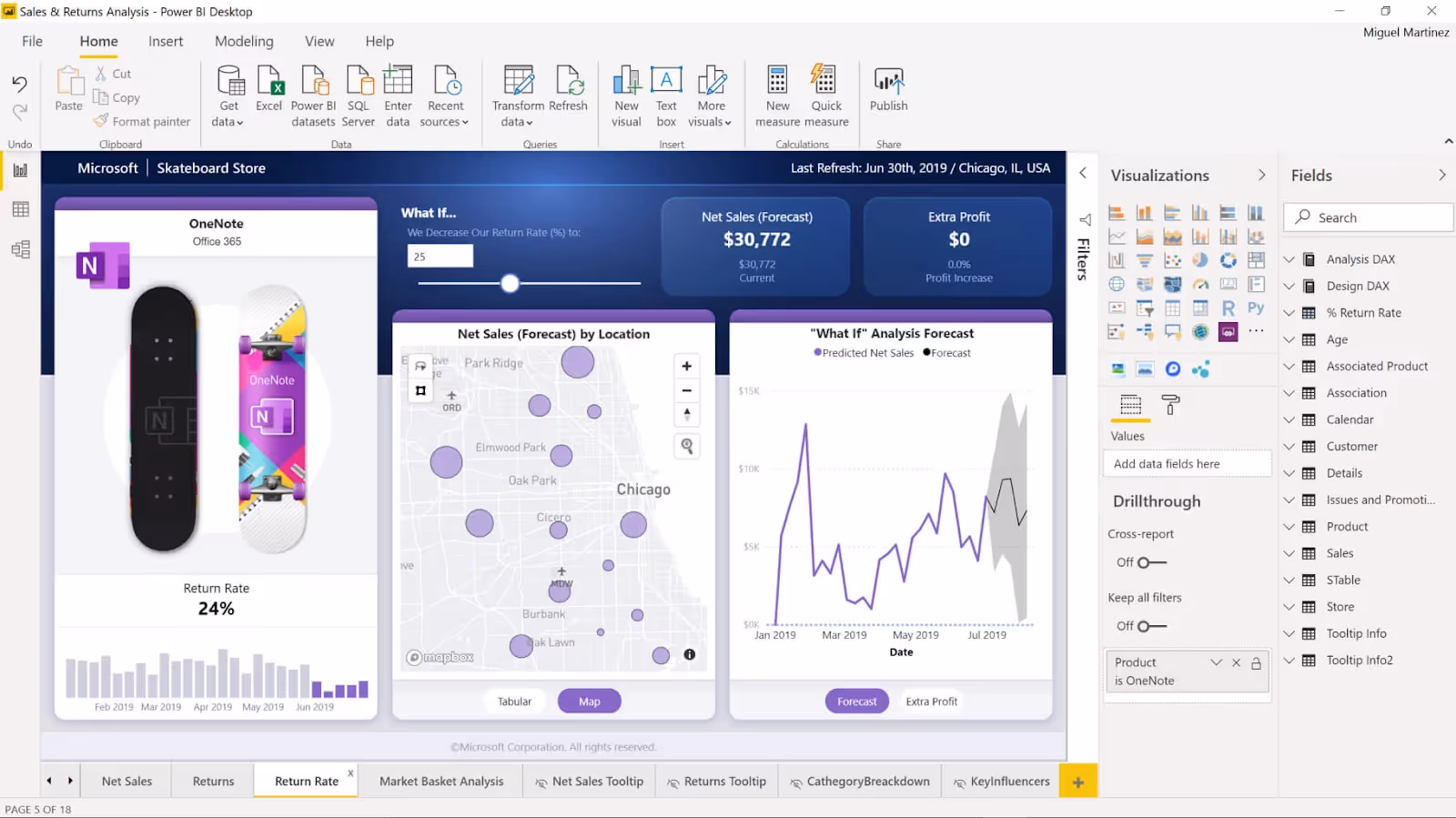
Best for: Teams already in the Microsoft ecosystem
Microsoft Power BI leads the data visualization tools market for good reason. It's powerful, affordable compared to competitors, and integrates seamlessly with Excel, Azure, and Microsoft Teams. Over 40 million people use Power BI actively.
What makes Power BI stand out? It connects to almost any data source. Your data lives in Excel? Cloud databases? APIs? Power BI reaches it. The drag-and-drop interface lets non-technical users build dashboards. Advanced users can write DAX formulas for complex calculations. Real-time dashboards update instantly. Your team always sees current data.
Price starts affordable for small teams and scales up for enterprises. If your company already pays for Microsoft 365, you may already have access to Power BI. That's a huge advantage over data visualization tools online that require separate subscriptions.
Pros: Easy integration with Microsoft products. Affordable entry point. Strong real-time capabilities. Growing AI features through Copilot integration.
Cons: The learning curve steepens when you move beyond basics. Non-Microsoft environments face integration challenges.
2. Tableau
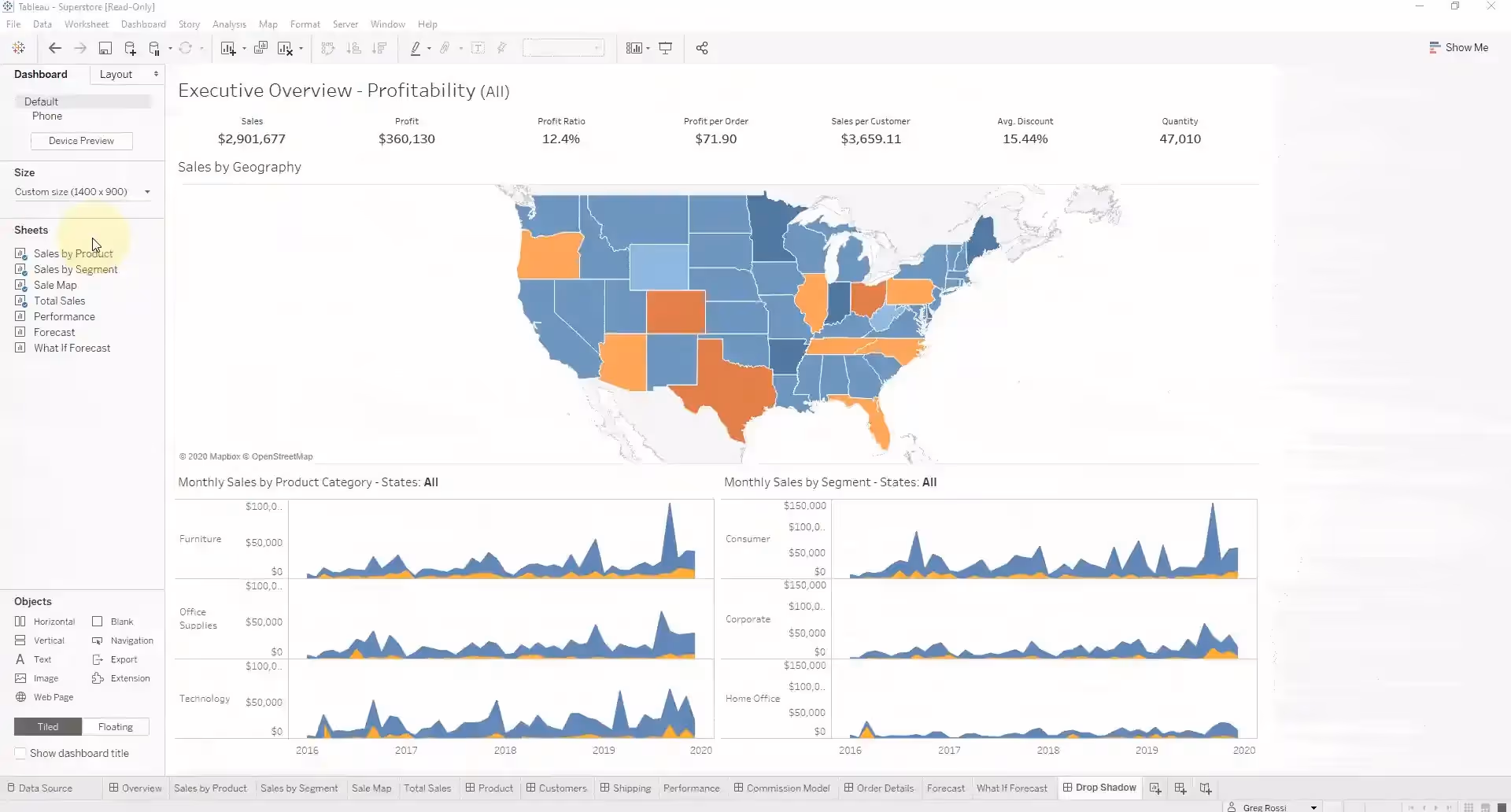
Best for: Complex data analysis and stunning visuals
Tableau is the gold standard for data visualization tools in data science and analytics teams worldwide. It handles massive datasets with ease. Its visualization capabilities exceed most competitors. If you need beautiful, interactive dashboards that tell stories, Tableau delivers.
The software excels at connecting to diverse data sources and preparing data for visualization without leaving the application. Tableau Prep lets you clean and transform data directly. That means less time in other tools and more time creating insights.
Tableau Public is the free version. Everything you create is public, but that's perfect for learning or sharing your work with the world. Paid versions offer privacy, advanced features, and enterprise security.
Pros: Industry-leading visualization quality. Handles complex data gracefully. Strong geographic visualization capabilities. Excellent community and learning resources.
Cons: High pricing for enterprise versions. Steep learning curve compared to simpler tools for data visualization.
3. Google Looker
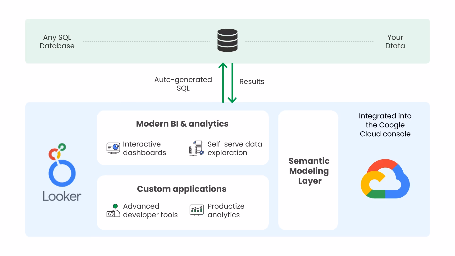
Best for: Teams embedded in the Google ecosystem
Google Looker (formerly Google Data Studio and now integrated into Looker) blends ease of use with power. It connects directly to Google Analytics, Google Sheets, and Google Ads. If that's where your data lives, Looker becomes invaluable.
The interface feels modern and clean. Drag-and-drop building works intuitively. Dashboards update in real time. Sharing happens with a link. Reports embed into websites effortlessly. For teams doing digital marketing or running Google Ads, Looker simplifies reporting.
Free tier includes basic features. Paid tiers unlock more data sources, automated reports, and advanced permissions.
Pros: Free entry point. Excellent Google integration. Beautiful dashboards. Easy sharing and embedding.
Cons: Best suited to Google-centric teams. Limited data connectors compared to other data visualization tools online. Premium features cost more than you'd expect.
4. Qlik Sense
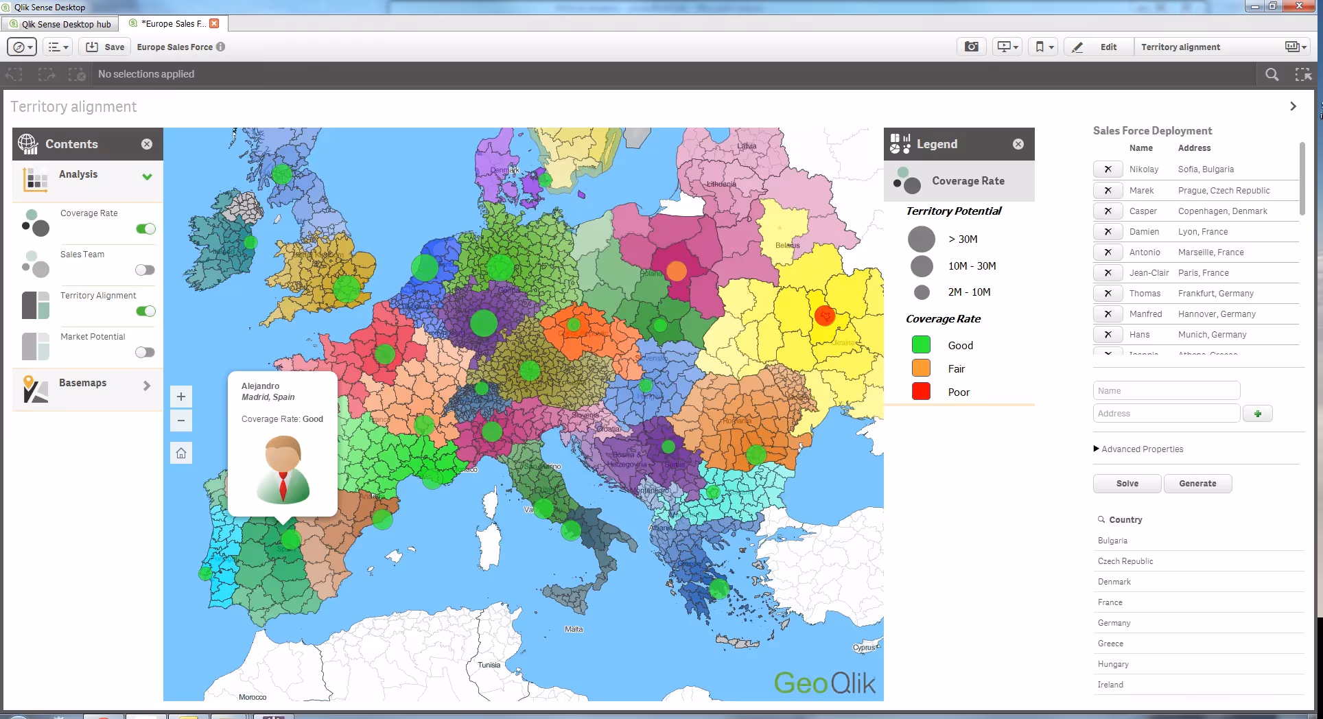
Best for: Self-service data exploration
Qlik Sense takes a different approach. Instead of static dashboards, it emphasizes exploration. Users interact with data freely. Select one data point and the entire dashboard updates instantly, showing relationships automatically.
This "associative" approach works wonderfully when you need to ask what-if questions or uncover unexpected patterns. The interface rewards curiosity. Qlik Sense handles large datasets efficiently through its in-memory engine.
The platform offers cloud and on-premise deployment. Teams value its flexibility. Mobile support is strong. Pricing sits between entry-level and enterprise-tier data visualization tools.
Pros: Unique exploration model. Excellent performance with big data. Strong mobile experience. Flexible deployment options.
Cons: Different approach than competitors—teams need training. Pricing can climb quickly with scale.
5. Plotly
Best for: Developers and data scientists needing customization
Plotly serves technical audiences. It's a Python library, a JavaScript library, and an online platform. If you code, Plotly gives you complete control. Create any visualization you imagine.
The library produces interactive charts that work in web browsers. Embed them in dashboards, websites, or applications. Plotly is particularly strong for scientific and technical visualization—3D charts, surface plots, network graphs.
Open-source version is free. Paid tier (Plotly Chart Studio) offers cloud hosting and collaboration features. Many data science teams use free Plotly for development and upgrade for production deployments.
Pros: Powerful customization for developers. Open-source foundation. Beautiful interactive results. Strong scientific visualization options.
Cons: Steep learning curve without coding experience. Community support is strong but different from commercial vendor support. Can be overkill for simple dashboards.
Comparing These Data Visualization Tools
Each serves different needs. Power BI wins for Microsoft-first organizations that value integration and affordability. Tableau leads for teams that need the most sophisticated visualization capabilities. Looker appeals to Google users. Qlik Sense excels at exploration. Plotly powers developers and data scientists.
Your choice depends on your specific situation—your team's skills, your data sources, your budget, your timeline. The best data visualization tools for one organization might be wrong for another.
Free and Open-Source Options Worth Knowing
Budget constraints? Open-source alternatives exist. Apache Superset runs on your servers. Metabase requires less setup than Superset but offers fewer customization options. Grafana specializes in real-time monitoring. D3.js, Matplotlib, Seaborn, and Bokeh are programming libraries that cost nothing.
Free data visualization tools online like Google Charts and Datawrapper work surprisingly well for simple projects. Tableau Public remains free as long as your work is public. These options let you start without investment and upgrade later if needed.
Conclusion
Data visualization tools have moved from luxury to necessity. The volume of data you collect means nothing without the ability to see it clearly. Raw numbers hide insights that visualizations reveal instantly. Your choice of tool matters, but starting matters more. Pick one, try it, learn from it. Whether you choose an enterprise platform or a free online tool, you'll quickly discover that visualized data changes how you work.
If you’d like to visualize Shopify sales data or get insights on competitor analysis, you can start using Dropshiptool’s services today.


.avif)